Hello Coders, In this blog post you will about how to make a responsive search bar with a navbar in HTML and CSS. It is very easy to create a responsive search bar and Navbar.
Let us start and learn about Navbar and Search bar. The navbar is an Interface element on a webpage that is used to link other pages. It is mostly present on the top of every website. A Responsive Search bar is an element that is used to search through our full website or webpage.

HTML AND CSS
Index.html
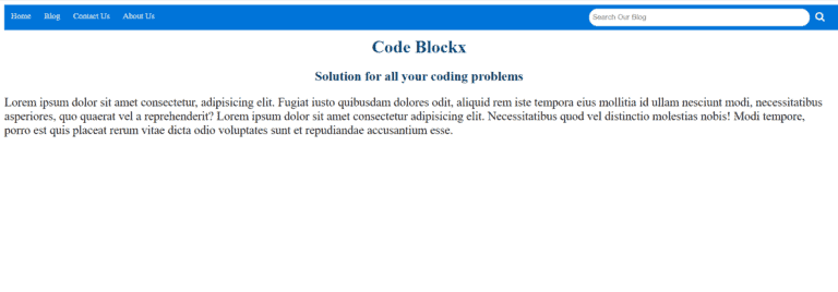
OUTPUT
Style.css
How to add a search icon in the Search bar?
Sometimes this question arrives about how to add a search button with the search bar. what is its code? so the solution to this is you need to add
Hope this blog was helpful to you. As you have now learned how to create a responsive search and nav bar in HTML you should now move ahead and learn to make a Responsive footer in HTML. We have explained it in detail here.
Thank you for visiting our blog. If you have any other questions let us know in the comments section. we will answere it as soon as possible.